
User Interaction Design: Principles for Clearer Digital Experiences
User Interaction Design: Creating Clear, Useful Digital Experiences
User interaction design is the practice of shaping how people use digital products and services. It covers the actions people take, the responses they receive and the steps they follow to complete a task. From tapping a button in an app to finding information on a website, every interaction can make an experience feel straightforward—or frustrating.
Good interaction design helps people achieve their goals with as little uncertainty and unnecessary effort as possible. It also helps organisations create products that are more accessible, dependable and enjoyable to use.
What is user interaction design?
User interaction design, often shortened to interaction design or IxD, focuses on the relationship between people and interactive products. It considers how an interface behaves, how information is presented and how users know what to do next.
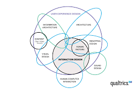
Interaction design is closely connected to user experience (UX) design and user interface (UI) design, but each has a different emphasis. UX design considers the overall experience a person has with a product. UI design focuses on its visual and interactive elements, such as menus, buttons and forms. Interaction design concentrates on how those elements respond to people’s actions.
For example, when someone submits a form, interaction design determines what happens next: whether the button shows a loading state, how errors are explained and how the user knows that the form has been received.
Why interaction design matters
People rarely use a digital product simply to admire its appearance. They want to book an appointment, find an answer, make a payment or complete another task. If the route to that goal is confusing, they may make mistakes, lose confidence or give up.
Thoughtful interaction design can:
- Make common tasks quicker and easier to complete.
- Reduce errors by making options and instructions clear.
- Help users understand what has happened and what to do next.
- Build confidence through consistent, predictable behaviour.
- Make products more usable for people with different needs and abilities.
Core principles of effective interaction design
Make actions clear
Users should be able to recognise what they can do. Buttons should look interactive, links should be distinguishable from ordinary text, and labels should describe the action they trigger. A clear label such as “Save changes” is usually more helpful than a vague one such as “Continue” when the outcome is known.
Provide useful feedback
Every action should produce an understandable response. If a user selects a filter, adds an item to a basket or submits a form, the interface should indicate that the action has been registered. Feedback might be a confirmation message, a changed button state or an updated total.
Feedback is especially important when an action takes time. A loading indicator can show that a request is in progress, while a completion message can confirm that it has finished.
Be consistent
Similar actions should work in similar ways throughout a product. Consistent labels, layouts and controls help users apply what they have already learnt. This does not mean every screen must look identical; it means that familiar patterns should behave predictably.
Prevent mistakes and support recovery
Good design reduces the chance of errors, rather than relying on users to avoid them. Helpful measures include clear form instructions, sensible default settings and confirmation before an irreversible action. When errors do happen, explain the problem in plain language and show how to fix it. Where possible, allow users to undo an action.
Keep the experience focused
Too many choices, instructions or visual distractions can make a task harder. Present the information people need at the point they need it, and avoid adding steps that do not serve a clear purpose. A simple experience is not necessarily one with fewer features; it is one where the important features are easy to understand and use.
Designing for accessibility
Interaction design should take account of people who use different devices and assistive technologies, as well as people with different sensory, motor or cognitive abilities. Accessibility is not an extra layer to add at the end; it should inform decisions from the beginning.
Practical considerations include ensuring that:
- Interactive elements can be used with a keyboard, not only a mouse or touchscreen.
- Focus is visible as people move through a page using a keyboard.
- Text and controls have sufficient contrast and are easy to read.
- Buttons and links have clear names that make sense when read aloud by assistive technology.
- Instructions and error messages do not rely on colour alone.
- Controls are large enough and spaced well enough to use comfortably on touchscreens.
Designing accessibly often improves the experience for everyone. For example, captions can help people watching a video in a noisy place, while clear form errors can help all users complete a task successfully.
A practical interaction design process
Understand the people and the task
Start by learning who will use the product, what they need to achieve and what might get in their way. User interviews, observation, surveys and support enquiries can all reveal useful details. Avoid relying only on assumptions about how people behave.
Map the steps
Break the task into stages, from the user’s first decision to the final outcome. This helps identify unnecessary steps, unclear choices and points where people may need reassurance. A simple journey map or task flow can make the process easier to discuss.
Sketch and prototype
Explore possible solutions with sketches, wireframes or interactive prototypes. A prototype does not need to be fully polished: it needs to be realistic enough for people to try the key interactions and give useful feedback.
Test with users
Ask people who represent the intended audience to complete realistic tasks. Observe what they do, where they hesitate and what they misunderstand. Usability testing is most useful when it focuses on behaviour rather than asking people whether they simply like the design.
Refine and test again
Use the findings to improve the design, then check that the changes have helped. Interaction design is rarely a one-off activity. Products evolve, user needs change and new evidence may reveal opportunities to make an experience clearer.
How to evaluate an interaction
Evaluation can combine observation with product data. Useful measures might include task completion rates, the time taken to complete a task, error rates and the number of people who abandon a process. Feedback from users can help explain what the numbers do not show.
Metrics need context. A shorter task is not automatically a better task if users are rushing or missing important information. The aim is to understand whether people can complete their goals accurately, confidently and without unnecessary effort.
Conclusion
User interaction design is about making digital products understandable and responsive to the people who use them. Clear actions, useful feedback, consistent patterns, accessibility and regular testing all contribute to a better experience. By focusing on real tasks and observing how people use a product, teams can create interactions that feel more natural and help users get where they need to go.
9 Essential Tips for Effective User Interaction Design
- Make primary actions easy to find.
- Use familiar labels and clear language.
- Give immediate feedback after each action.
- Keep navigation consistent across screens.
- Design touch targets large enough to tap.
- Prevent errors with sensible defaults.
- Explain how to fix errors clearly.
- Support keyboard and assistive technology use.
- Test designs with real users early.
Make primary actions easy to find.
Make primary actions easy to find by giving the most important button or link a clear, prominent position and an easy-to-understand label, such as “Book now” or “Save changes”. Use visual contrast and spacing to distinguish it from secondary options, while keeping its placement consistent across similar pages. This helps users see what to do next without having to search or guess.
Use familiar labels and clear language.
Use familiar labels and clear language so people can quickly understand what each option does. Choose words your audience already knows, and make button and link text specific—for example, “View your order” is clearer than “Continue”. Avoid unnecessary jargon, vague labels and long instructions. Clear wording helps users feel confident, reduces mistakes and makes tasks easier to complete.
Give immediate feedback after each action.
Give immediate feedback after each action so users know that the interface has registered what they have done. A button can change state when pressed, a form can confirm successful submission, and a progress indicator can show that a request is still processing. Clear, timely responses reduce uncertainty, help people spot mistakes and make the experience feel more reliable. Where an action takes longer, acknowledge it straight away and keep users informed until it is complete.
Keep navigation consistent across screens.
Keep navigation consistent across screens so users can find their way around without having to relearn the interface. Place menus, links and key controls in familiar locations, and use the same labels and behaviour throughout. This predictability reduces confusion, helps people move between tasks with confidence and makes the overall experience easier to use.
Design touch targets large enough to tap.
Design touch targets large enough to tap comfortably, especially on mobile devices where users may be navigating with one hand or in a hurry. Buttons, links and other interactive elements should be easy to select without accidentally activating nearby controls. Leave enough space between targets, too, and make sure they remain usable for people with limited dexterity or who use assistive input.
Prevent errors with sensible defaults.
Prevent errors by choosing sensible defaults that suit the needs of most users, such as pre-selecting a commonly used delivery option or setting a date field to the current date. Good defaults reduce effort and make forms quicker to complete, but they should never remove users’ control: make the selected option clear and easy to change, and avoid pre-selecting choices with significant financial, privacy or other consequences.
Explain how to fix errors clearly.
When an error occurs, explain clearly what went wrong and how to put it right. Use plain, specific language rather than vague messages such as “Something went wrong”, and place the explanation close to the field or action that needs attention. Where possible, preserve the information the user has already entered, identify the next step and offer a helpful solution—for example, “Enter a valid email address, such as name@example.com.” Clear, constructive error messages help people recover quickly without feeling blamed or having to repeat their work.
Support keyboard and assistive technology use.
Support keyboard and assistive technology use by ensuring every interactive feature can be reached and operated without a mouse. Provide a clear, visible focus indicator as users move through the page, keep the tab order logical, and use properly labelled buttons, links and form fields. Check that screen readers can identify each control and announce helpful instructions or error messages. These practices make interfaces easier to use for people with disabilities and can also benefit anyone who prefers keyboard navigation.
Test designs with real users early.
Test your designs with real users early, while ideas are still easy to change. A simple prototype can reveal where people hesitate, misunderstand a label or struggle to complete a task—issues the design team may not notice on its own. Use those observations to improve the experience before investing time in development, then test again as the design evolves.